Tuesday, December 15, 2009

12.16 Covers of Covers

Warm-up: 15min

P.O.T.D.
Q.O.T.D.: what is your favorite magazine? Find an image of the cover and post to your blog - this will serve as your inspiration for today's big ol' assignment.

Part 1 - Using a grid (20min)
Open your image in illustrator. Use the rulers to create a grid that will enable you to create a similar structure.

Part 2 - Finding the font (10min)
Use Cmmd + shift + 4 to capture an image of the you want to know the identity of.
Upload your screen cap to the following site: http://new.myfonts.com/WhatTheFont/

Part 3 - Put it all together (40min)
Match the original style by adding the following elements (where appropriate):
  1. cover model (use photoshop to remove backgrounds)
  2. background (use a filled rectangle to
  3. title (find the font and use it!)
  4. blurbs (use the correct font and layout)
  5. price (where does it go and how much?)
  6. UPC (what? where?)
  7. date (where? when?)
  8. volume number (where? which?))
SAVE FOR WEB AND DEVICES AND POST TO YOUR BLOG WHEN DONE.

Monday, December 14, 2009

12.14 - Reflection and viewing

Warm-up 15 min
1. P.O.T.D.
2. Qs.O.T.D.:
Reflect on your first year of high school (or first year at this high school). Answer in complete sentences.
  1. What is one thing you have learned in this class?
  2. What is your strength in DMA?
  3. What is your weakness?
  4. Do you need help to complete your assignments?
  5. Do you feel that you can help others?
  6. What do you think your teacher's strength is?
  7. What could he improve on to make the class more successful?
Viewing - Helvetica 75min
Download the questions and answer them with a partner for credit.

Friday, December 11, 2009

12.11 - Exhibition Poster!

Warm-Up (15 min)

1. POTD
2. Q.O.T.D.: Looking back at the last few weeks of class what has been the most interesting activity we have done (see previous blog posts to go back in time)? What has been the least interesting?
3. Vocab - test postponed till next week.

Part 1 - Examples of great/amazing/anti-bootsie poster design (15 min)

Choose one poster out of these links (or link that you find on your own) that you think you could replicate (ask your dear leader if you can’t find one). Please post to your blog.

1. http://www.smashingmagazine.com/2008/02/25/breathtaking-typographic-posters/

2. http://veerle.duoh.com/blog/comments/
winners_of_the_what_is_graphic_design_poster_competition/

3. http://wellmedicated.com/inspiration/50-amazing-gig-posters-sure-to-inspire/

Part 2 - Line (20min)
Using the pen tool
Stroke
Stroke color
Bending

Part 3 - Make the Poster (50 min)
Create your own poster based on your example (that you just posted to your blog).

1. Open a Print Document in Illustrator. Choose Letter size (8.5x11 INCHES)
2. Color mode CMYK
3. Use your typography skills in Illustrator(altering text) AND photoshop (altering images) that we have used in class.
4. Change the text from your example to the following:

Truth Be Told
Lower Division Exhibition
December 17th, 2009
6-8pm
Envision Academy of Arts and Technology
1515 Webster St.
Oakland, California

REMEMBER, NOT ALL INFORMATION WAS CREATED EQUALLY! CHOOSE THE IMPORTANT TEXT THAT YOU WANT TO STAND OUT, THEN MAKE IT STAND OUT!

Post to your blog when complete.

Wednesday, December 9, 2009

12.9

Warm up (10 min)
POTD
Find an example of "negative space" and post on your tumblr
Vocabulary

Part 2 - create a form with letters (30 min)
  1. Use Illustrator
  2. “Text Form”, Web, 900 pixels x 900 pixels
  3. Use Helvetica font
  4. Through altering the letters in the word for the thing you choose (e.g. jaguar, pill, cheese) to create a form of that word.
  5. This form should be recognizable to viewer.
  6. Consider the shapes letters make with their POSITIVE AND NEGATIVE SPACE.

POST TO YOUR BLOG WHEN COMPLETE

Monday, December 7, 2009

12.8 - Typography and U

Warm Up - (15min)
POTD
QOTD: Can letters be art? Look for an example on the interwebs and post it to your blog for today’s warm up.

Vocabulary:
typeography
bold
italic
positive space
negative space
color
case
kerneling
justification
scale

Typography Intro

What is it?
Where is it used?
Why is it important?
How can we use it?
Time for some awesome keynote!!!!!!!!!

Part 1 - Working with a given text (30min)

Use Adobe Illustrator create this project
“Text Project 1”, Web, 900 pixels x 900 pixels
Using a single set of text, create 9 different variations following the 10 rules of typography.
Arrange the type evenly on a 3x3 grid
Choose a line or two of the text to emphasize.
You may use ONLY ONE FONT.

Here is the text:

Truth Be Told
Lower Division Exhibition
6-8pm
Envision Academy of Arts & Technology
1515 Webster Street
Oakland, Ca.

POST TO YOUR BLOG WHEN COMPLETE

Friday, December 4, 2009

12.4 - Completing the Cover + Exhibition Posters

Warm - Up (15 min)
Task OTD:
Complete downloading your 3 symbols of wealth and power (with high contrast backgrounds and not cut off on the sides) and save to your desktop. If you already have these, move to the next part of the warm-up.

P.O.T.D.
Vocab review


Vocabulary Test (10 min)
GO TO: Classmarker.com

SIGN IN BY:
Download Usernames HERE

I WILL GIVE YOU THE PASSWORD.


Part 1 - Complete Album Cover (45 min)
(Students will be able to transform objects in PS)

1. Review last two steps - diamond + gold text, magic wand (10 min)
2. Transforming (5 min)
-Scale
-Rotate
-Skew
-Distort
-Perspective
-Warp
-Rotate
-Flip

Work + Export time (30min)

Part 2 - Exhibition Poster Making (50min)
(Students will use multiple programs to create a multimedia poster)

1. (PS) Old paper (
see part 2 of this tutorial) - Construct in PS and save As JPG and open in Illustrator.
Open a NEW PS DOC
Name it: POSTER PAPER
Choose "Web" Preset
Set width to 600 PIXLES
Set Height To 800 PIXLES
Press OK
Go to THIS LINK in a new tab

2. (ILL) Use of text (copy and paste the text below to add to your poster)
COPY AND PASTE EACH LINE SEPARATELY FOR MAXIMUM CONTROL.

Envision Academy of Arts and Technology

Truth Be Told Exhibition

December 17th

6 to 8pm


3. (PS) Use of Images - Save as JPG and open in Illustrator
- Use MAGIC WAND & TRANSFORM TO ALTER IMAGES.

Monday, November 30, 2009

12.1,2,4 - The Album, The Remix


Create your own album cover. Or remix an album cover to No Limit style. Add diamond & gold text, images of rich stuff and add some lens flares to get your new album out in Texas in 1993.

Warm up - 15min
QOTD:What things symbolize wealth? List at least three.
What things symbolize power? List at least three.
What is your dream pet? List one.
Using google image search download high quality images of these symbols you just named. Save them in a folder on your desktop.


POTD

Vocabulary:
  1. transform
  2. warp
  3. bevel
  4. emboss
  5. gradient
  6. contour
  7. rotate
  8. horizontal
  9. vertical
  10. distort
  11. perspective
Lesson - Create your own No Limit Records Pen n Pixel style album cover
(advanced photoshop techniques - building up skills for portfolio project)

Examples:
http://images.google.com/images?q=no%20limit%20records%20album%20covers&oe=utf-8&rls=org.mozilla:en-US:official&client=firefox-a&um=1&ie=UTF-8&sa=N&hl=en&tab=wi

This photoshop lesson is made up of three basic parts

1. Creating iced out text.
2. Removing backgrounds from images.
3. Transforming smaller images to fit your overall image.

Part 1 - creating some iced out text (45min)
(advanced photoshop techniques)
Go to the following link to find the tutorial for creating diamonds and gold text (or diamond n gold anything!).
http://www.photoshopcafe.com/tutorials/diamonds/diamonds.htm

SAVE!

Part 2 - Removing Backgrounds and Colaging (30min)
(review of intermediate technique)

Open in Photoshop the six images of wealth and power you downloaded yesterday. We are going to remove the backgrounds of these for your pen n pixel album cover using the MAGIC WAND.

Last time we removed backgrounds, we used the QUICK SELECTION TOOL. The MAGIC WAND is located on that same toolbox spot (quickkey = w).

Using the magic wand has some options. The first option we’ll look at is the TOLERANCE.

TOLERANCE can be set from 0 - 255. The lower your tolerance the fewer different color variations will be selected; the higher the tolerance, the more colors will be selected.

So, if you are trying to get part of a blue sky background removed and there are slightly lighter and darker portions of the sky that are NOT being selected, you should INCREASE the tolerance. Conversely, if you are trying to select a dark background and your hair keeps on getting selected as well, REDUCE the tolerance.

Actually, we did this before the break on our postcards. Here is the link:
http://lddma0910.blogspot.com/2009/11/1120-background-replacement.html

SAVE!

Part 3 - Transforming images to fit. (15min)
(review of beginner technique)
We did some of this also last week. However we can also warp, distort and change perspective by entering the free transform mode THEN right clicking on the image.

SAVE!

EXPORT FOR WEB AND DEVICES AND POST ON YOUR BLOG WHEN DONE! SAVE THE PSD DOC TO YOUR SERVER!

Thursday, November 19, 2009

11.20 - postcards


We need to get going if we want to get to our super secret project. To get there we need more Photoshop practice and
skillz.

Today, after we finish our inspirational posters, we will work on two techniques to get rid of boring backgrounds, and ad funky fresh ones.

Warm up - 15min
1. QOTD: What is your paradise? Where would you like to go for a vacation? Is there anyone famous who you would like to met there?
2. Photo of the day.

Part 1 - 25 min
Finish inspirational posters. See last blog for instruction.
Examples. Complete in class.

Part 2 - Making a postcard to your fans (45 min)Replacing background with magic wand and/or quick selection tool.
  1. open photo of yourself (use your POTD)
  2. duplicate layer
  3. mute your bottom layer
  4. select quick selection tool
  5. choose new selection tool and change the brush size to 10pt
  6. select areas around your head and shoulders (selecting less of the background is better than selecting part of yourself)
  7. delete the selected areas with the delete button (be careful not to delete yourself!)
  8. use history or undo to go back
  9. select all
  10. copy
  11. use google search to find you paradise (try searching: beach resort, mountain lodge, beverly hills mansion, Indian slum)
  12. download the FULL SIZE image of your choice
  13. open that image in PS
  14. make a duplicate layer of your background
  15. paste your big ol’ head and shoulders on the background (you copied before, remember?)
  16. use FREE TRANSFORM to make your head fit on the image
  17. select the UNLOCKED background layer
  18. go to FILTER > GAUSIAN BLUR adjust accordingly (the effect should look like you are in-focus and your background is SLIGHTLY out of focus, just like in a real photo).
  19. use a soft eraser (reduce the opacity and flow to 40%, and the size to 10px) to brush away any hard edges around your head and shoulders)
  20. add some cheesy "greetings" using your text tool
  21. EXPORT FOR WEB AND DEVICES
  22. UPLOAD TO YOU BLOG WHEN DONE AS "PHOTOSHOP POSTCARD"
Part 3 - Choose an item form the past 2 weeks of photoshop to review (15min)
options include:
  • shoe
  • makeover
  • michael
  • inspirational poster

Tuesday, November 17, 2009

11.17 - Shop Class

Warm-up - 15 min
1. Question of the day: What do you like about using Photoshop? What would you like to be able to do with this software? What is the most challenging thing about using photoshop?

2. Photo of the day

3. Vocabulary (write definitions and examples for each word):

  1. tools window
  2. history window
  3. character window
  4. move tool
  5. hand tool
  6. free transform
  7. layers window
  8. save for web and devices
  9. marquee tool
  10. lasso tool
  11. deselecting
  12. menu
  13. smudge tool
  14. liquify filter
  15. magic wand tool

Part 1: (dis)-Inspirational Poster (40-60 min)
(learning new tools and techniques to use in project)
We have all been to the dentist’s office, right? (If you haven’t you should go, you probably have a ton of cavities!) In those offices, hanging on the waiting room wall, you, I, somebody, often
finds inspirational messaged posters. We’ve probably all seen the "footprints" one. Or the cat on the tree with the phrase “hang in there.”

Here is a step by step video for you visual learners out there. (press play, fullscreen on the menu, it's 5 min long)


Now it’s your turn to join in on the fun. Follow these easy steps and don’t forget to make
a fun, funny, or really inspirational title and message!
  1. Open photoshop.
  2. REGISTER LATER!
  3. Before you open your new document, change the background color to black
  4. Now, go open a new document
  5. Name your new document “inspirational poster”
  6. Choose “Web Document”
  7. Change background contents to “background color”
  8. Search for an image you want to use for your poster (try using different search terms or sites depending on your interest - remember this is for school! examples: funny animals, video game screenshots)
  9. Drag the FULL SIZE image from your Internet browser to your photoshop canvas
  10. Move your photo into the center using your move tool
  11. Make your image bigger or smaller using “Free Transform.” Press “enter” when you get your image the right size.
  12. Add a title - this should be short and give the reader the idea of what they are looking at.
  13. Open your Character window (at the right side of your top menu window>character. This gives you access to fonts and font colors.
  14. Choose white as your font color.
  15. Choose Times New Roman as your font.
  16. Use 50pt font and put CAPS LOCK on for your title.
  17. Center your title with the move tool.
  18. Back to the text tool, type in your message text below your title.
  19. Center your text with the mover tool.
  20. Change your font size to 18pt.
  21. Make your frame (the white line around the image) select your rectangle tool (2 tools below the text tool) from the toolbar.
  22. Choose black as your foreground color.
  23. Draw a rectangle around your image, it should be slightly bigger than your image on all sides.
  24. Move this new rectangle layer down on the layers stack, below the image (lower right corner of your screen).
  25. Right-click the rectangle layer (shape 1). Select “blending options”
  26. Check the last box, “stroke”. Click just to the right of the word stroke to bring up the options on the right-hand side.
  27. Set size to 1px
  28. Choose white as the color.
  29. Choose “outside” for the position.
  30. Press OK when done.
  31. FILE > SAVE FOR WEB AND DEVICES
  32. SAVE AS JPG OR GIF
  33. UPLOAD IMAGE TO YOUR BLOG. Title “Inspirational Poster”

Part 2: For those finished with the poster here is a "Speed Review" - 45 min
(reinforce the technical knowledge necessary to using photoshop and completing project)
We are only going to get good at using photoshop if we practice! Budget your time here wisely. When you finish part 1, export and move on to part 2.

All three parts should be posted to your blog as "review 1,2,3."

Part 1 (15min)
Review layers, fill and color selection by creating a custom shoe.
(download the shoe form this link: CLICK HERE!)

Part 2 (15min)
Review layer masks and color balance
Use today's photo of the day and change the hair color. I love highlights!


Part 3 (15min)
Review liquifying, brush size, brush hardness, brush flow, brush opacity, layer masking, brightness/contrast, blur tool. Use the following photo:

Friday, November 13, 2009

11.13 Like Mike Makeover

Warm up - 15min
POTD
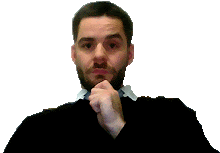
QOTD: Why do you think Michael Jackson gave himself such an extreme makeover?
Study Vocabulary

Part 1 - Vocabulary Quiz (15min)
Go to classmarker.com and sign in using the username sheet on your desktop.
I will give you your password after we have reviewed the basic rules of testing. Here are the rules;
1. No talking during the test. As long as one person is testing, you are not talking.
2. Raise your hand if you have a question.
3. If you finish early, move onto the next section of the agenda, quietly.
4. Keep your eyes on your own computer.


Part 2 - Celebrity Makeovers 70 min
One more photoshop task for the week. Get ready because this one is even more ____ than the last one.

We are going to give a makeover to a celebrity. Not just a normal makeover though - we are going to give them the ultimate makeover!

More Photoshop Makeovers


Michael Jackson


1. Change the shape of the nose, jaw and cheeks using the Liquify filter (15min)


Create a duplicate layer Layer > Duplicate Layer. Name it “Michael Nose”

To change shape of nose, jaw and cheeks to new Michael go to the top Menu > Filter > Liquify

Lower brush size, density and pressure

Zoom-in using command and +

Gently, in small steps, drag in the sides of the nose. Drag up jaw cleft and line. Drag up cheek bones.

You can always “cancel” or “restore all” to undo any changes.


2a. Use the dodge tool or layer mask to lighten Michael’s skin tone (15min)


Create a duplicate layer, call it “Michael Skin

Select midtones and keep the exposure low (15%). This will make the changes you make seem more smooth.

Be sure to stay on Michael’s face! If you go off the face use the eraser tool (with a low opacity and flow - 30% each) to get rid of unwanted lightening.

Reduce opacity of the layer to 70% to reduce hard lines.

or


2b. Use the layer mask and brightness/contrast to lighten or darken skin tone. This is a similar technique to the one we used to change our hair and eye color the other day.


3. Change Michael’s Lip color using the brush tool (15min)


Create a new layer (shift + command + n), call it "Michael Lips"

Select a color from your tool bar palette for your lip gloss.

Make you brush small (10), and reduce the opacity to 50%.

Zoom-in (command and +) around Michael’s lips.

brush on the lips and be careful not to get any on his teeth!

Go back to your tools color palette and choose a slightly darker color. Use this color to outline the lips.

Use the smudge tool and reduce the strength to 40%. Smudge the outside liner in with the first color. This should give your lip gloss a smooth look.

Adjust the opacity of the lips layer to 55% to help achieve the lip gloss look.


Save to Web and Devices, change width to 400px, apply, save and upload on your tumblr blog when finished.


If you think that was too easy and you really want a challenge, try to put Michael back together again using the image below. If you don't feel like messing with Michael, use another celebrity of your choice. (25min)

Export and upload your makeovers to your blog.

Wednesday, November 11, 2009

11.11 Hair Color Adjustments!

Warm-Up
P.O.T.D. (we will need this for our tutorial)

Part 1 - Change Your Hair Color
Time to go from ashy to class - yes, I said it!

This tutorial involves the following:
  1. READING
  2. CAREFUL ATTENTION TO DETAIL
  3. HAVING 2 WINDOWS OPEN AT THE SAME TIME
If you think you can handle it, proceed. If not, well, let's proceed anyway.

Here's the original:

Here is my breakdown of the steps:

1. Choose a photo to work with, Lets use one with HAIR in it (no hats or hoods). Open it with Adobe Photoshop.


2. Now duplicate the layer (Layer > Duplicate Layer)


3. Press Command-U to colorize it. Click the colorize button and drag the saturation all the way up. Now adjust the hue slider until it's the color you want.


4. Now with the colorized layer selected, go to layer & add layer mask & hide all. The color will disappear for the moment and look like the original layer. We must now tell the mask which parts to reveal.


5. To do that, simply select white as your color and get out your paintbrush . Choose a medium sized brush with a soft edge (reduce opacity and flow to 50%). You may have to zoom in on some parts but you'll see how easy the color glides on. You don't have to be perfect here, just get it the best you can, it will be easy to touch up later.


6. Now all you have to do is set the blending mode to soft light. That's it! On lighter color hair I've found that setting the blending mode to hue works a little better, just try out a few and see what you like. If you ever want to adjust your layer mask, simply click on the mask itself (to the right of the layer picture in the layers palette) and use the color black to hide, and the color white to reveal.
The same method works for eyes and clothes.


7. Go to File > Save For Web and Devices and save your image to post on your blog.


Tuesday, November 10, 2009

11.10 Color Theory and Design


Warm - Up - 15min

Q.O.T.D.: What is your favorite color? What does this color mean to you?

P.O.T.D.

Vocabulary (copy and paste the following list to your blog. Find definitions and give an example sentence for each word - test on Friday).
  1. Complementary
  2. Primary
  3. Secondary
  4. Tertiary
  5. Saturation
  6. Hue
  7. Contrast
  8. Context
  9. Chroma

Part 1 - A Bit About Color Theory (15 min)
Get ready to listen and participate!

Part 2 - Color Meaning/Symbolism Search (20 min)
Use the Color Quest form to find the meanings of black, white, primary and secondary colors.

Use google, yahoo, bing!, or any other Internet search tool to find meanings. Below are some places to start:

Instructions:
1. Select the layer you want to color from the layer palette.
(Do NOT touch the bottom layer)
2. Choose the desired color from the colors palette.
3. Use the fill function to fill that part.
4. Once done, flatten the layers and save for web in jpg (at least 60 quality).
5. Post to your blog with your reflection.
File>Save for Web and Devices > Image Size (400x__) > Apply > Save
Useful Keyboard Shortcuts:
Fill with Foreground Color: Alt+Delete

Reflection Quesitons:
What is the name of your shoe? What colors does your shoe use (primary, secondary, tertiary) ? What do those colors represent (red = anger, black = power)? What is the relationship of the colors (complementary, analogous)? What does the use of this color combination mean?

Extra Bonus:
Making your own template:
http://www.pixeldigest.com/shoe_template.html